Harnessing the Power of SHAP Values: Unveiling the Magic Behind Machine Learning Predictions
In the realm of machine learning, the predictive prowess of models is undeniable. But what if you could not only predict but also understand why? Enter SHAP — your key to unlocking the black box and demystifying model predictions. In this article, we embark on a journey to harness the power of SHAP values, exploring both their global and local interpretability. So buckle up, as we dive into the world of SHAP and demystify its magic with a hands-on Python example.

The Essence of Interpretability
Before we dive into the workings of SHAP I’d like to point out a great resource I have personally used in the past, that is the Kaggle notebook by BeXGBoost, Model Explainability with SHAP: Only Guide U Need.
Model interpretability is the beacon that guides us through the complexity of machine learning models. It’s about going beyond predictions and comprehending the reasons behind them. Enter SHapley Additive exPlanations or SHAP — a toolkit that promises to illuminate the path to understanding.
Derived from cooperative game theory, Shapley values allocate contributions fairly among participants. In the machine learning context, SHAP values distribute the contribution of each feature to the difference between the actual prediction and the average prediction across all possible feature combinations.
In other words, we can see how different features from our model interact with each other and the strength of those interactions. We can analyze these interactions over an entire training set, Global Interpretability, or at the individual prediction level, Local Interpretability. But enough explaining what SHAP values can do, let’s jump into a hands on example so you can follow along and see for yourself.
Gather Data
Before we jump into coding, lets first gather our data. For the example we will be using the “Wine Quality” dataset donated by Paulo Cortez and team to UC Irving and available via their website. The two datasets are related to red and white variants of the Portuguese “Vinho Verde” wine. for the sake of this example we will just use the white wine dataset.
The data can be downloaded as a ZIP and then unzipped in a local “data” repository to be accessed via you console. I’d recommend using Jupyter for this and the rest of the example. Below we will import our libraries, read the data and concatenate them into a single dataset.
import pandas as pd
df = pd.read_csv('data/winequality-white.csv', sep=';')
The dataset consists of the following 11 features;
- fixed acidity (g(tartaric acid)/dm³)
- volatile acidity (g(acetic acid)/dm³)
- citric acid (g/dm³)
- residual sugar (g/dm³)
- chlorides (g(sodium chloride)/dm³)
- free sulfur dioxide (mg/dm³)
- total sulfur dioxide (mg/dm³)
- density (g/cm³)
- pH
- sulphates (g(potassium sulphate)/dm³)
- alcohol (% vol.)
The the target variable;
- quality
All of the features are values that can be lab measured before the assessment of the wines quality by expert tasters.
The white wine dataset contains 4898 records. Most of which have a quality score of 6,
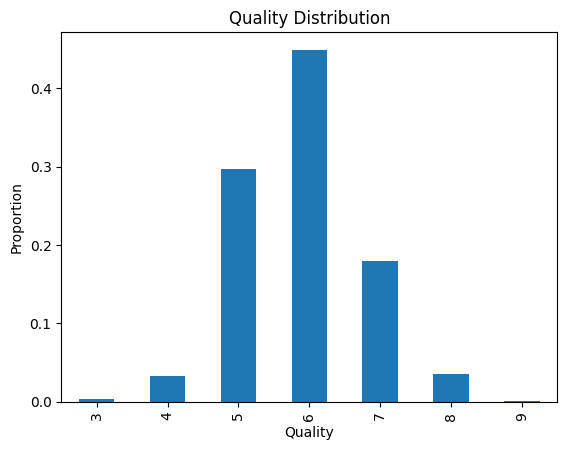
The target variable, “Quality”, ranges from 0 (poor quality) to 10 (high quality). This variable is assigned by experts and is based on human judgement so some small amount of variability is expected.
Training a Simple Model
Global interpretability refers to understanding the overall behavior of a machine learning model across the entire dataset. SHAP values provide us with an elegant avenue to explore feature importance on a global scale.
Before we start calculating SHAP values we need to import our libraries, split our data and train a XGBoost model,
import xgboost
from sklearn.model_selection import train_test_split
features = ['fixed acidity', 'volatile acidity', 'citric acid', 'residual sugar', 'chlorides', 'free sulfur dioxide', 'total sulfur dioxide', 'density', 'pH', 'sulphates', 'alcohol']
X_train, X_test, y_train, y_test = train_test_split(df[features], df.quality, test_size=0.2)model = xgboost.XGBRegressor()
model.fit(X_train, y_train)Here is a simple summary of the model’s performance,
- root mean squared error — 0.6224
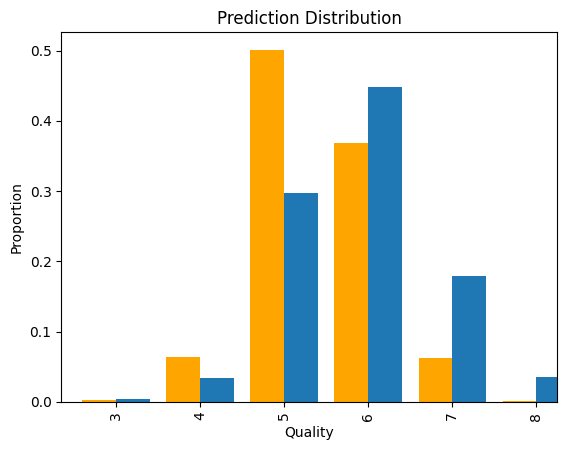
- The model is definitely not the best. There are a number of ways it could be improved, feature selection would be a good first step as the dataset info does note that there is high correlation between a number of features.
Global Interpretability with SHAP
For the sake of this example, let’s continue on and calculate SHAP values so we can visualize the global feature importance using a summary plot.
Summary Plot
explainer = shap.TreeExplainer(model)
shap_values = explainer.shap_values(X_test)
shap.summary_plot(shap_values, X_test)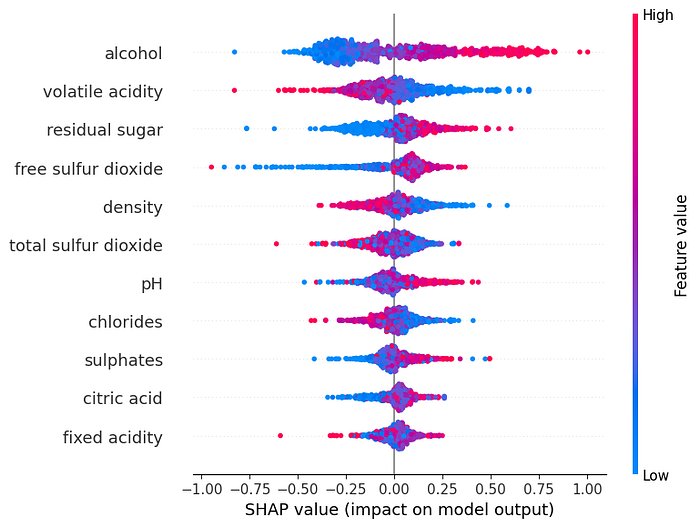
The summary plot shows how each individual feature impacts the models predictions across the entire dataset. In the summery plot, each feature is represented along the horizontal axis and the corresponding SHAP values are shown along the vertical axis. These SHAP values represent the extent to which the each feature contributes to a predictions deviation from the model’s average prediction/baseline.
The color of each feature indicates its value. This can be especially important in describing the models behavior and each feature values impact.
By default, the features are sorted by there sum impact on the model so the most impactful features will be at the top of the summary plot. This sorting could be used in place of the XGBoost feature importance which is based on how often a feature is used to split the data across all decision trees in the ensemble and how much this splitting improves the model’s predictive performance.
It is helpful when building a model to try and understand what the summary plot for each feature is trying to tell you. For our example we can draw the following insights for the top three features,
- Alcohol — wines with lower alcohol tend to drive the quality lower while higher alcohol wines tend to drive the quality higher.
- Volatile Acidity — The bulk of wines have little impact but there is a notable amount of high and low values driving the quality low and higher, respectively. The Vinho Verde wine is appreciated for its freshness so perhaps this feature impacts this sensory response of the experts.
- Residual Sugar — Wines with little residual sugar tend to get lower quality scores versus those with higher residual sugar. Vinho Verde is a summer wine so perhaps sweetness is an important factor.
I’d recommend continuing the process of explaining the global importance for all features. It will provide you will great context of the problem and a deeper understanding of your model.
Dependance Plot
One of the strengths of SHAP values is that they are based on the interaction between features. We can see the interactions between a feature and other features using a dependance plot. For instance, the dependance plot of alcohol and the feature with which it most strongly interacts, volatile acidity, can be seen below,
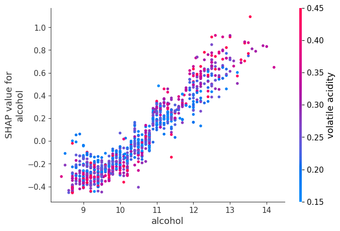
shap.dependence_plot('volatile acidity', shap_values, X_test)Using dependance plots we can dig deeper into each features effect on the dataset. We can see a pretty strong trend of increasing SHAP value as the alcohol increases. We can also see from the color gradient that wines with high volatile acidity and alcohol > 11% generally have larger SHAP values than wines with low volatile acidity. The opposite is generally true for wines below 11% alcohol.
Local Interpretability with SHAP
Now we come to a something that really makes SHAP values standout. Local interpretability delves into explaining individual predictions made by the model, i.e. we can now see what is driving each prediction.
Using the same data, model, and SHAP explainer we can produce a Force Plot for each record. Before we plot the force plot we can make of SHAP values array into a Pandas Dataframe. This is convenient if you are wanting to see the SHAP values alongside features.
shap_df = pd.DataFrame(shap_values, columns=features, index=X_test.index)
idx = 123
shap.force_plot(explainer.expected_value,
                shap_df.reset_index(drop=True).iloc[idx].values,
                X_test.reset_index(drop=True).iloc[idx])
I prefer a waterfall plot of the above though, this can be displayed using the following code,
shap.plots._waterfall.waterfall_legacy(explainer.expected_value,
                                       shap_df.reset_index(drop=True).iloc[idx].values,
                                       feature_names=X_test.columns)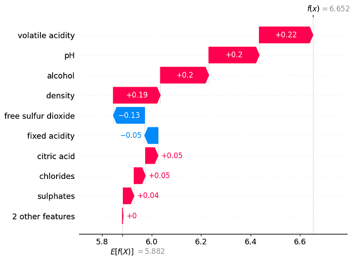
Using the waterfall or force plot we can see what features interacted the most to influence the prediction of the quality score. We can see for the 123rd record in the test data that volatile acidity, pH, alcohol, and density all increased the predicted score by roughly 0.2 from the base value. Looking at how these features are distributed across the test we can start to see how the 123rd record is different.
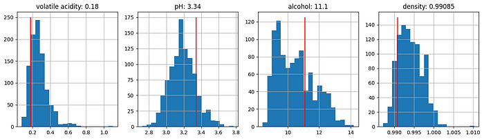
It looks like the volatile acidity and density of the 123rd record is lower than the bulk of wines while the pH is higher. The Alcohol is also slightly higher than the bulk of other wines. All of these are good attributes to have according to our summary plot so its no surprise that out prediction for this wines quality (6.65) is higher than the mean quality score (5.86).
Conclusion
SHAP values offer a dual perspective — global insights into feature importance and local explanations for individual predictions. By incorporating SHAP values into our machine learning workflow, we gain a deeper understanding of our models, ensure transparency, and unlock valuable insights from our data.
I’m hoping the above toy example helped you understand how you too can use SHAP values to open the black box and demystify your models predictions.
If you’d like to get in touch with me to explain any projects or just have a chat about data science, you can contact me on LinkedIn or by email.
